Lutanen Health Branding
Elevating a physician-led concierge practice into a brand that feels as approachable and considered as the care it delivers.
Overview
Lutanen Health was founded by Dr. Jay Luthar, MD — a Harvard Medical School-affiliated internist — out of a conviction that modern medicine had lost something essential: time, presence, and relationship. The practice is a return to what he calls “something timeless” — a physician who actually knows you, unhurried visits, and care that compounds like interest over years.


Logo & type pairing
The central metaphor that anchors everything is the tree ring: “Like the rings of a tree, care here deepens over time: layer by layer, year by year.” This is the soul of the brand. It frames health not as a series of transactions, but as a living, growing relationship between doctor and patient. It’s also a quiet nod to longevity — the very thing Lutanen is built around.


Color palette
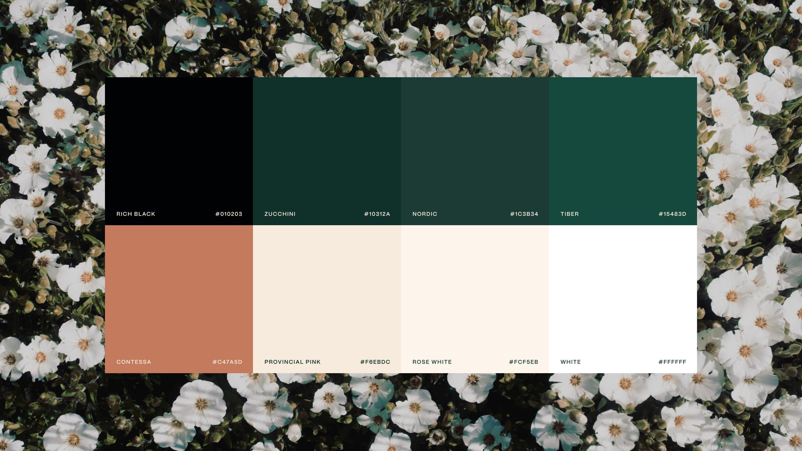
The brand language points toward a palette of warm neutrals and deep, muted naturals — the antithesis of clinical white and antiseptic blue. Think aged linen, forest greens, warm stone. Colors that feel like home, not a hospital.
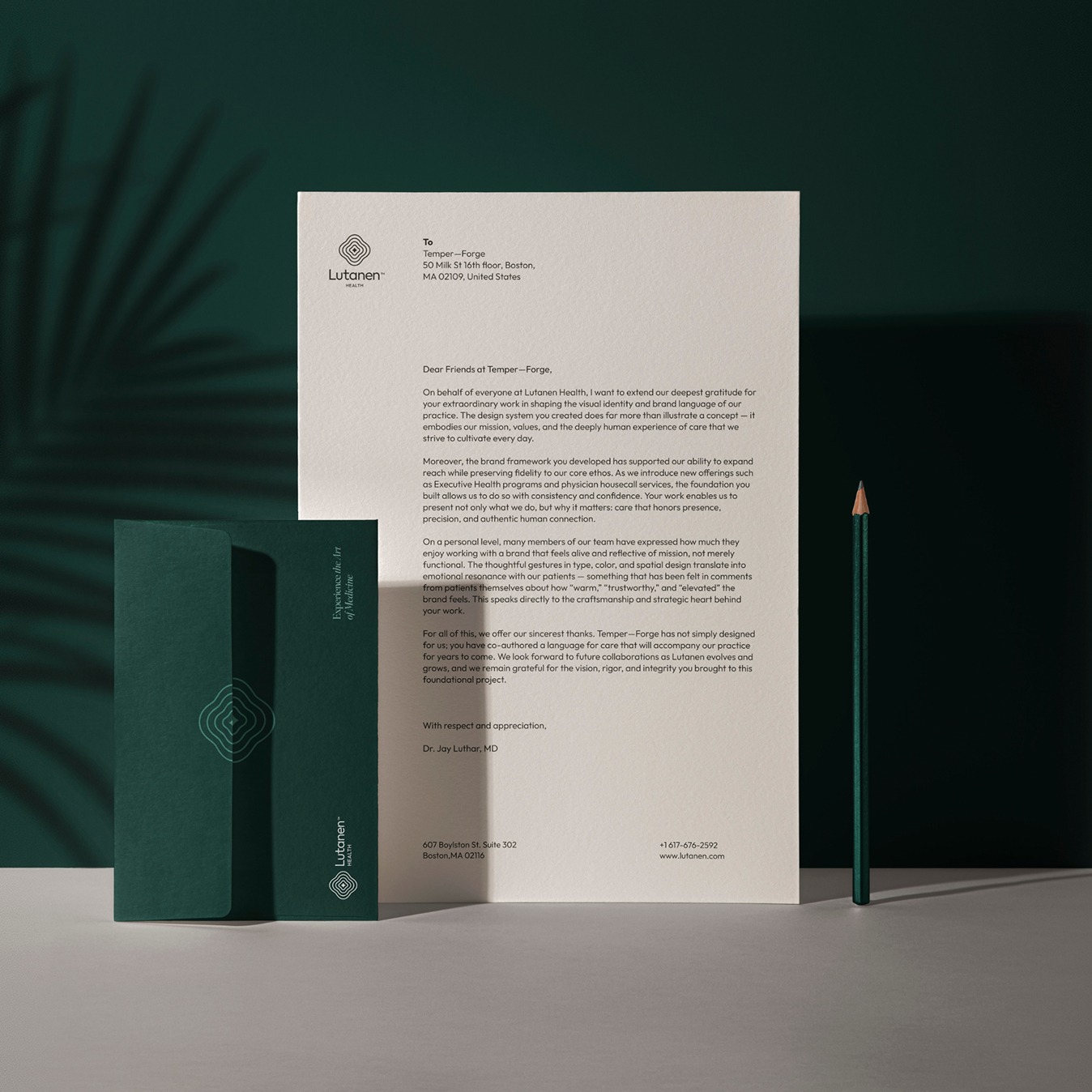




A few of our favorite strategic outcomes.
All Work