Why Do Website Designers Rely Upon Website Design Patterns?
Website designers don’t have to reinvent the wheel to build a new site. In fact, sticking with tested best practices almost always yields better results and provides quicker solutions. Internet users have grown so accustomed to common website design patterns that they barely notice them. At the same time, people unconsciously tend to like these familiar layouts and features.
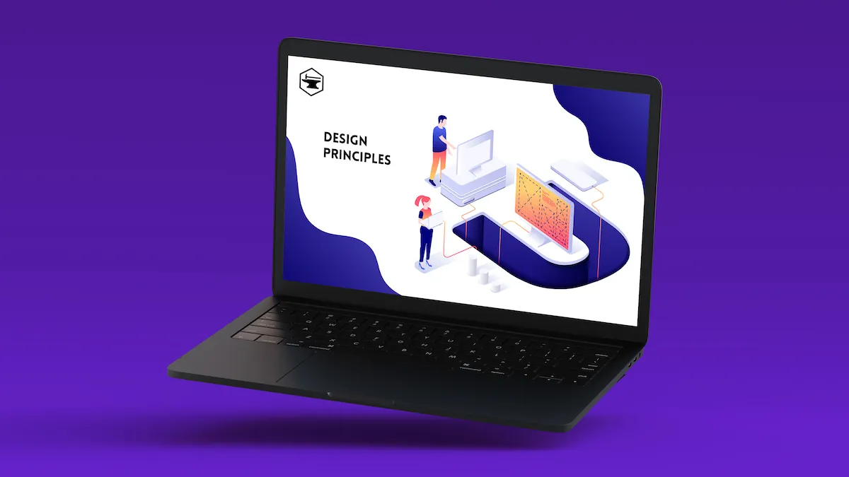
Calling them patterns may mislead some people. No set of templates or specific layouts make up website design patterns. according to HubSpot. Rather, a website design pattern, sometimes called a UI design pattern, refers to guidelines that evolved to solve specific user-focused issues.
Thus, designers adhere to these guidelines for two compelling reasons:
- They help ensure a user-friendly and trustworthy design.
- They offer solutions to common user interface design issues.
For a specific example, a website page only has so much space. Even more, contemporary designers strive to keep pages from looking cluttered. At the same time, the user interface can’t ignore the importance of offering useful navigation features.
Various kinds of dropdown menus emerged to give users the option to replace at least some of the content with links to other options. For example, the so-called hamburger menu displays three horizontal bars, so users know that’s the button to push to display a menu.
Examples of Common User Interface Design Patterns
For a closer look at user interface design patterns, consider three more examples that will probably appear surprisingly familiar.
The Law of Continuity
The Law of Continuity made its way into web design best practices from the discipline of Gestalt psychology. When presented with a collection of objects in a pattern, people tend to automatically perceive it as a group. They focus on the overall pattern first before narrowing their focus to individual objects. Even more, the overall pattern offers an invitation to follow it.
Under YouTube Videos, users can browse a column of suggested videos, made as inviting as possible with its suggestion to follow the list and the recommendation algorithm that displays options based on the current video’s topic and the user’s past behavior.
Anticipatory Design
Anticipatory design strives to anticipate the users next move based upon past actions. They use that prediction to make an offer to simplify taking that action.
Consider Order Genius, a mobile app from Peapod. The app displays suggestions based on past orders, time of year, and other relevant factors. Order Genius also lets customers move products to their shopping cart with a click. Larger internet companies, like Netflix and YouTube, have employed anticipatory design with their recommendation algorithms for years.
Micro Interactions in the Context of Macro Interactions
When somebody decides to buy a sofa, they usually consider that piece of furniture in the context of furnishing their living room with attractive, complementary, and comfortable furniture. That’s why images of sofas usually display the piece in a living room setting and not in the box. While people may perform actions at the micro level, they intend to meet a larger goal.
In a similar sense, a website offers micro interactions in the context of its macro purpose, which is probably selling something. For some examples, shoppers need to set up an account and navigate the website before making a purchase. These micro interactions can help warm customers up for the sale because they’re helpful and pleasant.
To better understand the benefits of thoughtfully designed micro interactions, consider some examples:
- Data entry: Few people enjoy setting up a new account, especially when it comes to coming up with a unique password that conforms to security rules. Adding helpful tips and an animated progress bar can add engaging gamification to the task.
- Swiping: Particularly on phones or tablets, swiping feels more natural than clicking tabs. It also encourages the use of more graphics and images than text, which helps engage people more.
Which UI Design Patterns Work Best for Specific Businesses?
Pattern guidelines help UI design teams solve problems, connect with customers, and keep visitors engaged. The best choices may depend upon design issues, customers, and even devices. As an example, old-style tabs may function well on PC apps, but swiping could offer a more elegant solution for mobile apps.
Contact Temper and Forge to share your design issues, and we’ll offer you tested solutions.

